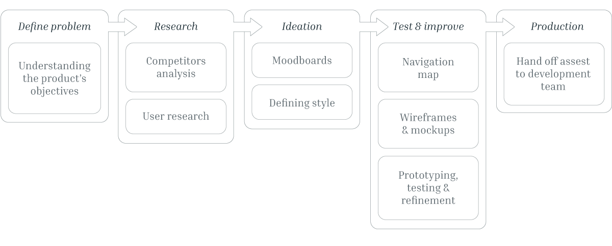
The design process
Cruisale is a mobile app that attempts to attract millennials into cruising, the app has the goal to help the user to find and book a cruise.
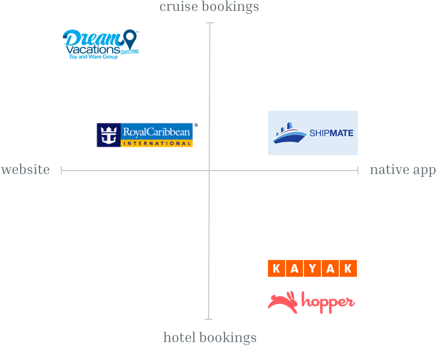
On one hand, current cruising booking servers have difficulty showing the information on a mobile device screen. The existing apps are cumbersome and the consumer gets lost in the massive amount of information presented to them.
On the other hand, the apps that are mobile friendly shows only a cruise line, e.g. Royal Caribbean only offers its own cruise line, this narrows the user’s options.
Creating a native mobile app that shows all cruise lines options available in the same place, making it easy for the user to find the best option for them regarding price, itinerary and style.
Descriptive Words: Cruise, travel, best price, simplicity, reliable, fun, easy.
Project owner, UX|UI designer (me) and two developers.
Sketch and InVision were used for the design phase and Slack and Zoom for communication between members of the team.
None of the competitors is a native booking cruise mobile app which means a huge advantage for us.
However, we looked over the web direct competitors to analyse their user’s flow and over the indirect competitors such as hotel bookings apps to brainstorm.
Considering that the app's desired outcome is to attract millennials into cruising, we researched about the target audience and found interesting facts. This was useful to better understand the audience and create meaningful features.
of millennials shop around for the best deal before booking.
of young adults look for travel inspiration on social media.
of Millennials want to travel abroad as much as possible.
of millennials are disappointed by bad mobile experiences.
We created two potential users that might use the app to helps us to understand their goals and pain points:

She is looking forward to live a new experience travelling on a cruise. She does not know much about the different types of cruises that are in the market and needs some guidance to find the best option for her.
user's goal: To find out what would be the best cruise for her to have fun with her friends.

He has gone on a cruise before and is looking forward to repeating the experience but this time wants to do a longer trip.
user's goal: To explore the different cruise offers locations and find out the one that is more appealing to him and his partner.
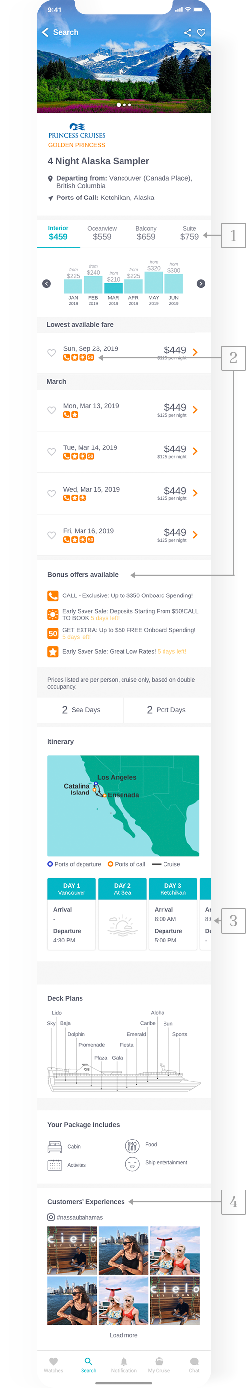
The top level of the application starts with ‘watches’ where the user will save his/her favourite cruises. Followed by ‘search’ to find deals, then ‘notifications’ to keep them updated, ‘my cruise’ for information about any past or upcoming trips and ‘chat’ to clarify any doubts with the customer support team.
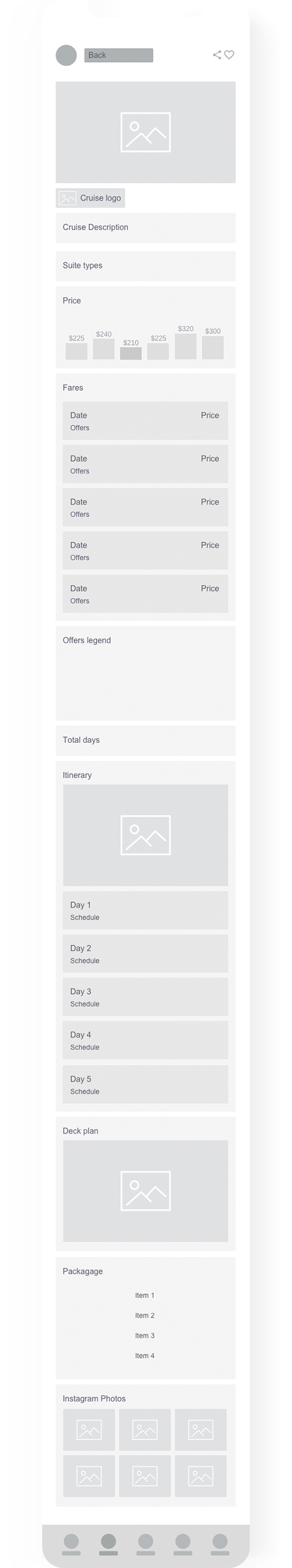
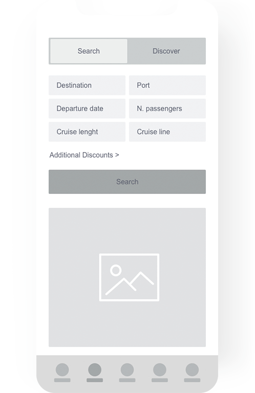
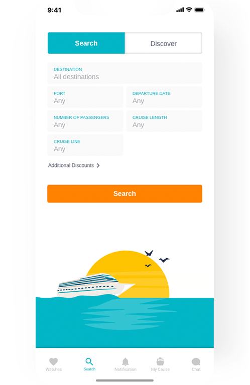
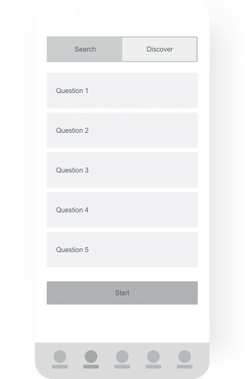
After this we brainstormed based on the research, I created the moodboards, defined the style and proceeded with the wireframes (left image) after they were discussed with the team and approved by the project owner, I carried on with the mockups (right image) as follow:
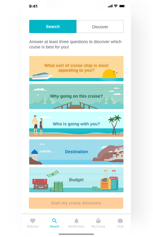
In order to solve users’ goals, we create two options for the searching, the first one is the screen ‘search’ which is the ordinary way to filter results for those who want to browse.
The second option helps those users that are not sure about what kind of cruise is best for them, so we ask them some questions to nail the results according to their expectations.
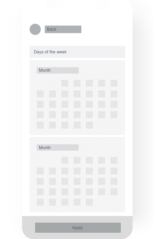
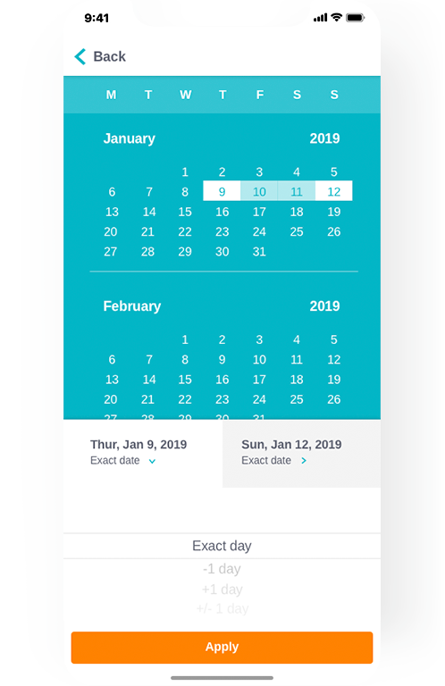
Users will be able select a preferred date but if they want can also choose some days before or after the preferred date on the same query in order to obtain more results.
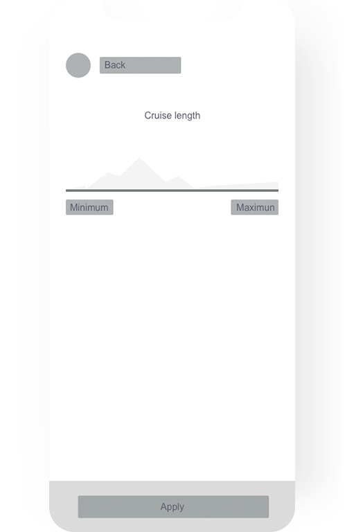
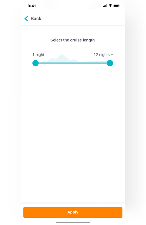
To provide a more efficient interaction with the user I designed the filter for the 'cruise length' as a slide bar with a graph in the background representing the variation on the number of results. In that way, the user can easily see what cruise length has more results.
Out of all the screens of this application, this was the most complex due to the large amount of information that it contains, which I loved to do because it was a great challenge.